Why Do Designer Logos Look Different on Some Pieces?
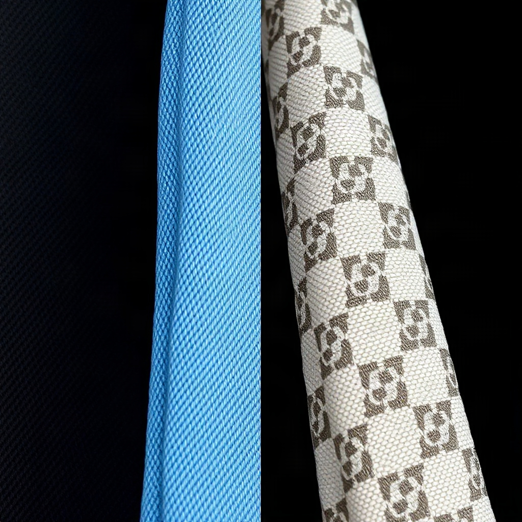
Production Changes Over Time
Brands update their logos, production methods, and placement. A logo that looks slightly different than your reference image might simply be from a different production year or factory. This is normal and not necessarily a sign of inauthenticity.
Multiple Authorized Factories
Designer brands contract with different manufacturers across regions. These factories have slightly different equipment, so logo embossing depth, stitching around logos, and hardware attachment varies slightly between pieces—all legitimately.
What Actually Indicates a Problem
Look for inconsistency *within a piece*: one logo crisp and one blurry, uneven spacing, letters that don't align properly, or materials that don't match the brand's standards. A logo that's just slightly different from your reference photo is usually not the issue.
Checking Multiple Reference Points
Never authenticate on logo alone. If the logo looks slightly off but everything else checks out—materials, stitching, construction, hardware weight—the piece is likely authentic. Conversely, a perfect logo on a piece with poor materials elsewhere suggests a fake with good logo reproduction.